BUILD TO HELP
BRANDING + GRAPHIC DESIGN
BUILD TO HELP
Build To Help is a not-for-profit organisation that believes in giving back to the world. Their legacy is to leave a positive footprint on this earth.

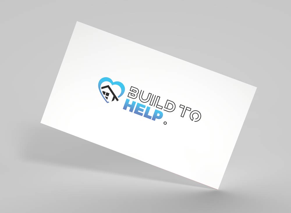
We were tasked with creating a logo and symbol that functioned as a visual representation of these ideals.


Business card front

Business card back


The outline style typeface conveys a work in progress. This has been chosen to resemble blueprint designs. In contrast, the solid, bold typeface was chosen to convey a completed and finished task